
Nowadays, data has become the new gold. Every company needs to collect data and analyze it in order to grow and become more successful. In analyzing this data, well-crafted reports – which are also one of the key elements of Business Intelligence – are very valuable.
Why are reports so important in business?
Reports allow business users to make decisions, based on well visualized data. According to a Forrester analysis, organizations with a high data culture make up to 3 times more accurate decisions. In turn, accurate decisions translate into increased revenue for the company.
Rules for creating reports
#1 Transparent form
A well-done report must be well thought out. Putting too many tables and visualizations in it can overwhelm the user. A report that will contain only very relevant information may be more informative than one filled to the brim with it.
It is also a good way to divide the report into sections. This will make it easier for the user to orient himself in the report, to find the information he/she is interested in faster.
#2 Aesthetics of the report
Keep in mind that the chosen colors, fonts are also very important. Using too wide palette of colors that differ significantly from each other is not a good idea. The same goes for fonts. It may distract the user analyzing such a report.
So, remember to use preferably one font or fonts from one set, and colors from one consistent color palette. Let’s also pay attention to whether the colors and fonts we choose are sufficiently legible.
#3 Selecting the type of chart
Each type of graph has its own application. For example, a line graph is a good option when we want to show changes in values over time, a trend. A pie chart is used when we want to compare proportions, but it won’t work well when we have too many categories, or the differences between their proportions are too small. Then perhaps a sorted bar chart, for example, will work better.
#4 Chart description
Let’s also remember about the title of the chart, descriptions of axes, units – formulated clearly and understandably. Even the most pertinent visualization will not be worth anything if the user does not know what he or she is analyzing. Let’s also remember to round the numbers.
#5 Range of axes on the chart
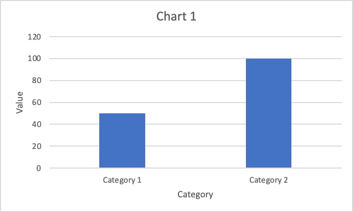
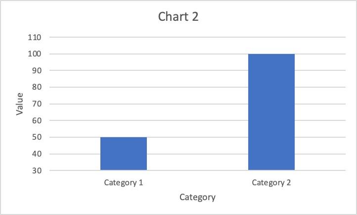
The Y axis on charts should start at zero. If we choose a different value as the minimum, the first conclusions of the user viewing the report may be misleading. Let’s look at the example below. The values in the two charts in each category are the same – the value for Category 1 is 50, and the value for Category 2 is 100. In the first chart, it is clearly visible at first glance that the value in Category 2 is twice as high as in Category 1. In the second chart, where the Y axis starts at a value of 30, the first conclusion we come to is that the value in Category 2 is even 3 times higher than in Category 1.
Summary
These are just a few basic rules for creating valuable reports. However, it’s worth keeping them in mind when you start working on creating a new report.
We can help with that!